Not Another Spotify Rebrand

Spotify has built its responsive platform on 3 major components; search, browse and discover. But the navigation and interface functionality can be made simpler, more pleasant, and more productive. This is a case study of a redesign concept for the Spotify Mobile App.
Spotify is already a considerable app, solving problems the user’s faces. Where the opportunity lies, is how the features are positioned. While Spotify’s algorithm stands out amongst the rest, the usability and accessibility of the UI seem reprioritized. Users are not using Spotify to its fullest potential due to their lack of knowledge. The application misses opportunities by not being intuitive enough for users to know about its capabilities.
THE UX AUDIT
After capturing screenshots of every screen, I reviewed the common flows, side by side, on a large wall. Typically, I would gather data to hypothesize where and how the workflows are breaking, to locate the needed areas of focus. These are my general findings:
Poor Placement
The search field should be larger and at the bottom of the screen, better for finger hot-spot zones.
Hidden features. For example, if you want to edit a playlist. First, you have to go into “Edit” mode. As you can see, there is no visible edit mode. For that, you’ll need to click into the kebab icon in the upper right-hand corner (almost hidden in plain sight).
Poor Functionality
Recent should be a filter and when playing a song should auto-expand to full screen with last song and next song showcased on the top and bottom of the playing song.
I am viewing the song currently playing, you can not interact with the album art. In fact, the large piece of real estate takes up a majority of the screen and does nothing at all.
Misleading workflows. If I want to get to the album, I have to click the name of the song or band below it. You might assume it would take you to the band page.
MOBILE RESEARCH
People who are dominant in their right-hand is most common. Therefore, right-handed people are more skillful with their right hand when performing a task with their hands and vise versa. Studies suggest that approximately 10% of the world population is left-handed. Understanding this would suggest when you design for mobile, think about the tasks at hand and how the user is performing it (with their hands).


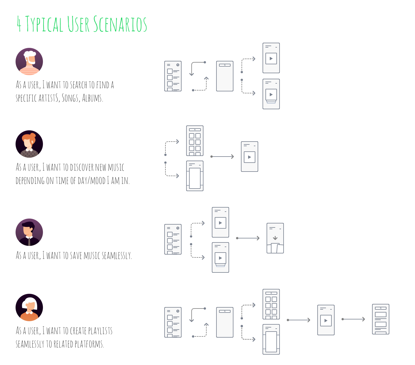
THE USER SCENARIOS
Define which features are important to the users’ flow of use, and make it clear. I spent hours of mapping and rearranging, here’s a summary of what I have gathered:
Users want to navigate between searching/browsing and selecting music quickly
Users want to find things easily and efficiently
Users want their music to be kept organized
Search Recommendations
Search bar placement
Smart search with faster typeahead functionality
The splash page is historical search (aka recently listened to)
Playlist Recommendations
Add touch gesture capability. ie - hold your finger on a song, and it would lift up on the Z-axis, allowing you to move it
Don’t hide reversible changes in an edit mode.
The command to delete an item should be available in an item-specific menu rather than a separate edit mode unless the deletion is highly consequential to the user.
Avoid kebab icons and don’t use the same icons to mean multiple things.

REFLECTION
I would like to be able to investigate further into Spotify's interface architecture. Ideally, this involves measuring data through tools to identify flows, purchases, churn, etc.
User has the ability to search simply. This helps reduce cognitive load for novice users while power users can still make use of all search modifiers they know of.
User has the ability to save /store/edit within 2 interactions or gestures
Create a more accessible product to cater to a larger demographic
Make it more consistent between desktop and mobile - ie editing playlists
